Case 02 / 07 · B2B web shop · Concept
All4feet
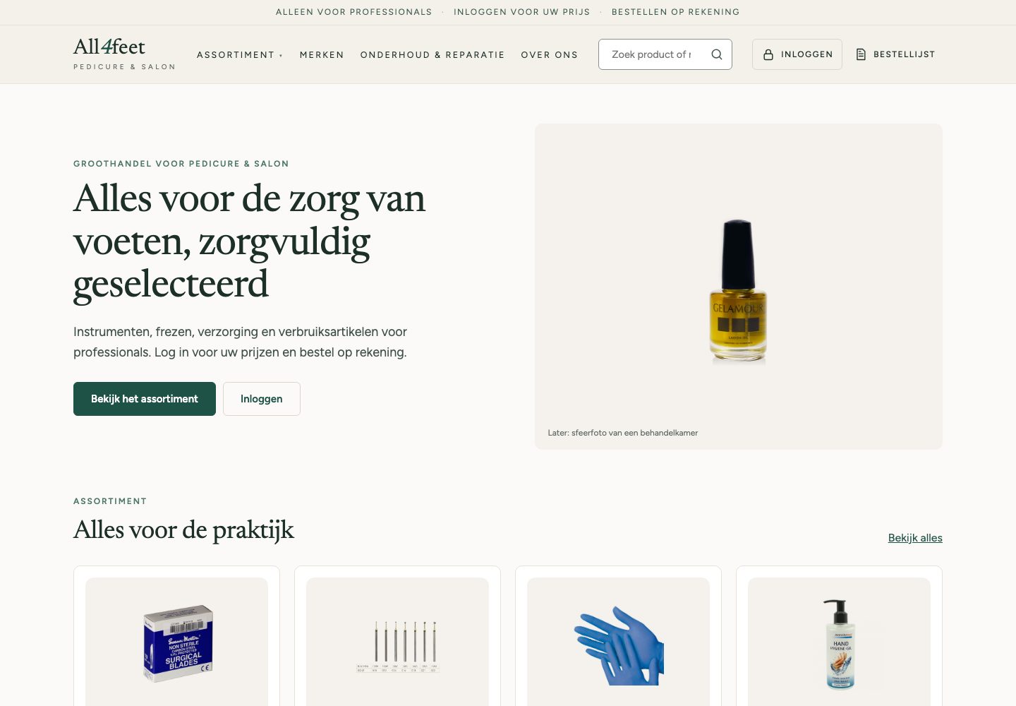
A wholesaler of pedicure supplies with 1,308 products on software from 2010. A concept where professionals log in, see their own price and send an order that the team checks: an order request, not a checkout.
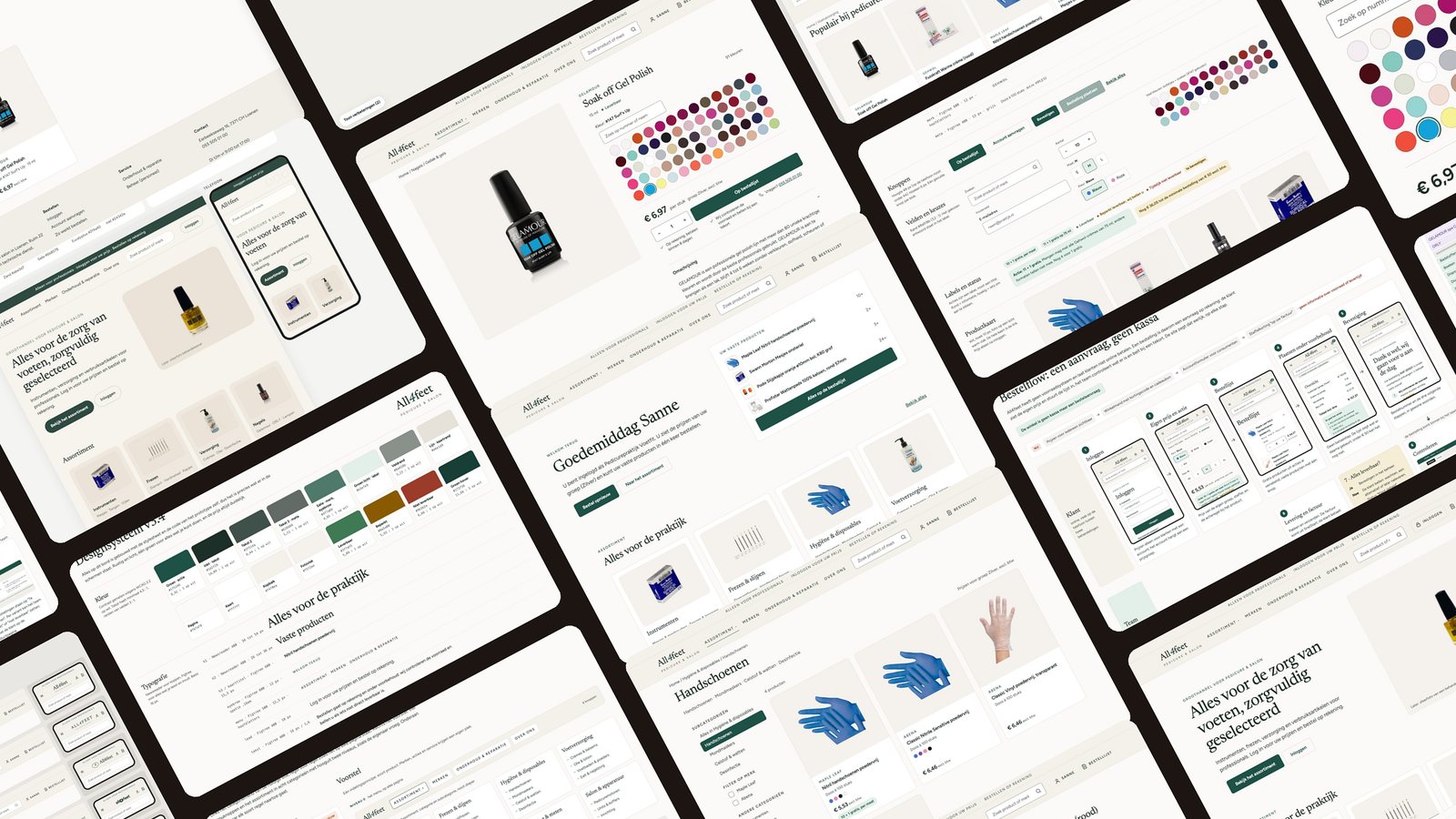
Pedicurists reorder the same supplies between clients, often on a phone, but the shop hid prices, discounts and its own core range.
Audited the shop, pitched a concept to the owner, rewrote the brief after his answers, rebuilt two whole brands as data, and audited my own design with the same method.
39 menu lines down to 4 buttons, 160 brand listings down to 45 products, 36 of 51 audit findings solved. Not yet tested with users.
Context
The challenge
A shop that works against its customers
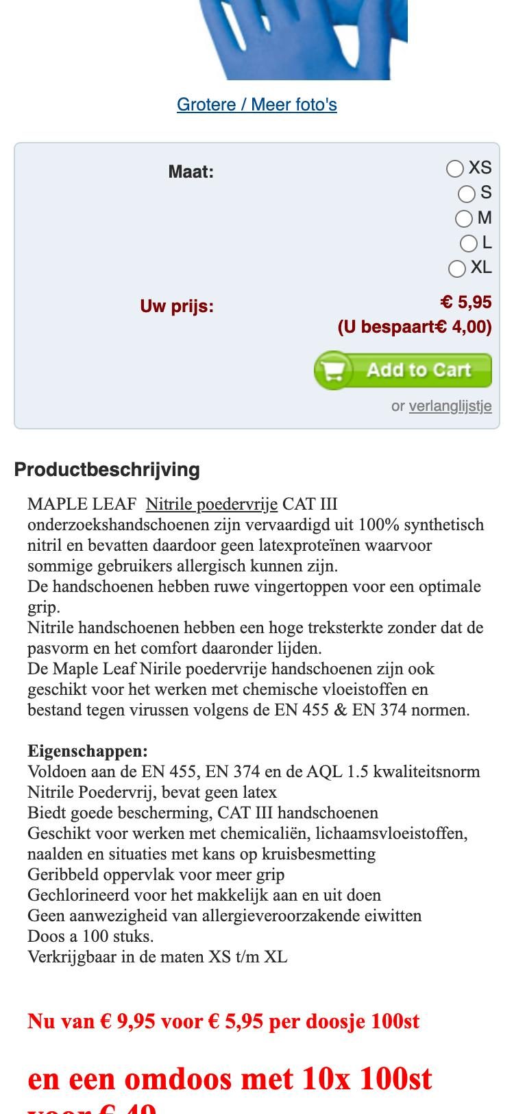
The customers are pedicurists and salons who order the same things again and again, often on their phone between two clients. The shop made that hard: tier discounts only on the invoice, every colour and size a separate product, a core gel polish range in no category at all, and no quantity field on the phone.
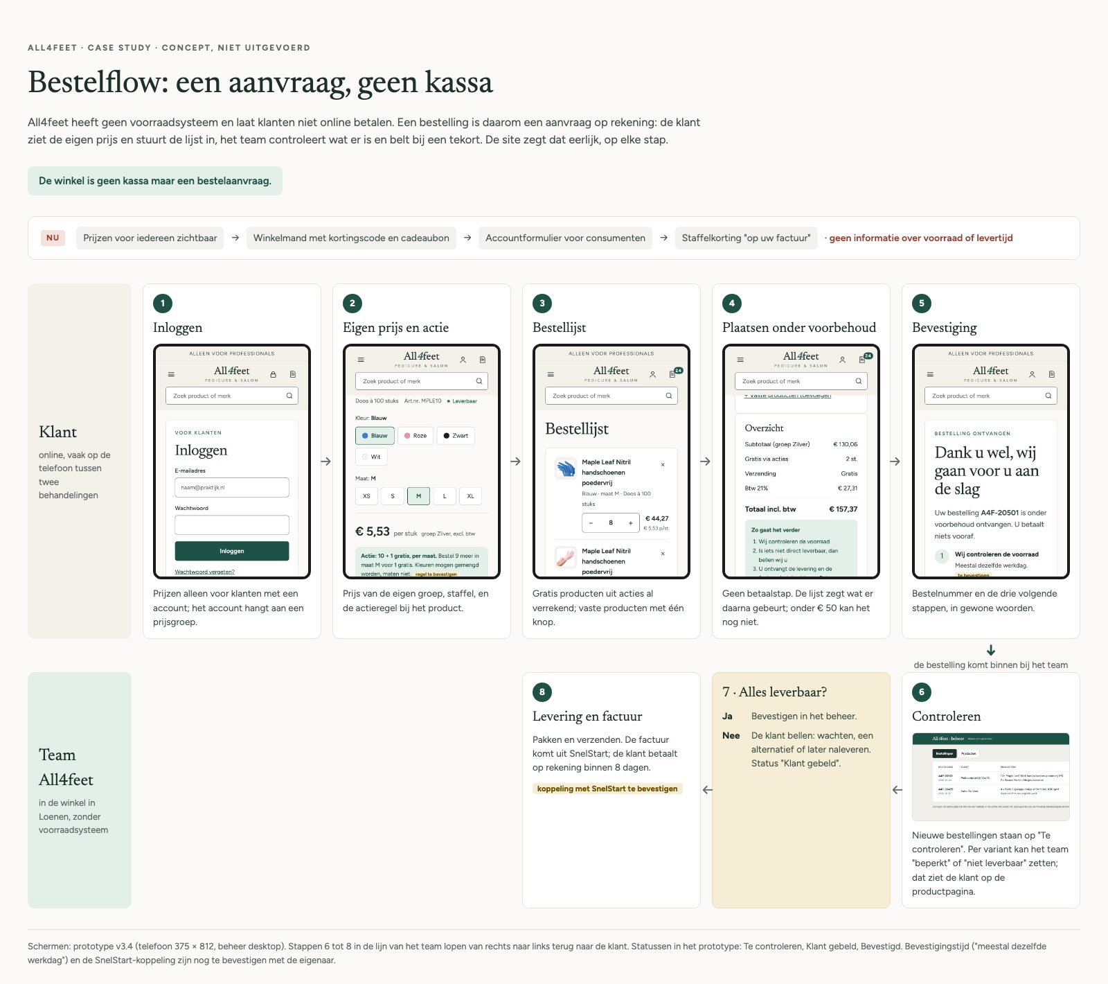
The shop isn't a checkout. It's an order request.
The name is used with permission. This is a concept and a proposal; the shop was not rebuilt.
The audit
51 findings, each rated
I checked the live shop on desktop and on a phone against Nielsen's heuristics. Every finding got a severity, an effort and a fix, so the owner could see what to do first.
94 of the 107 Gelamour listings, almost all of them gel polish colours, only findable through search.
“We calculate the extra discount on your invoice.” The biggest advantage of buying in bulk was invisible.
Size radios of 13 by 13 pixels and an English “Add to Cart”, but no way to order ten boxes.
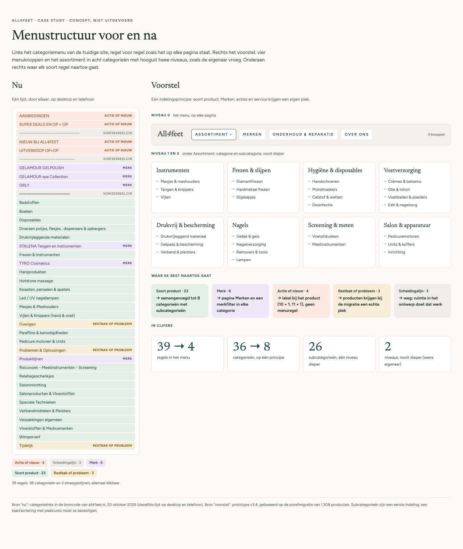
36 categories and 3 clickable divider lines at one level: brands, product types, three kinds of offers and catch-alls.
Fourteen glove listings for what are really four products.
“nitril handschoen” shows a tanning glove first; “reparatie” finds nail filler, not the repair service.
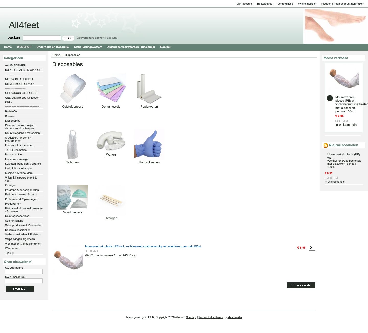
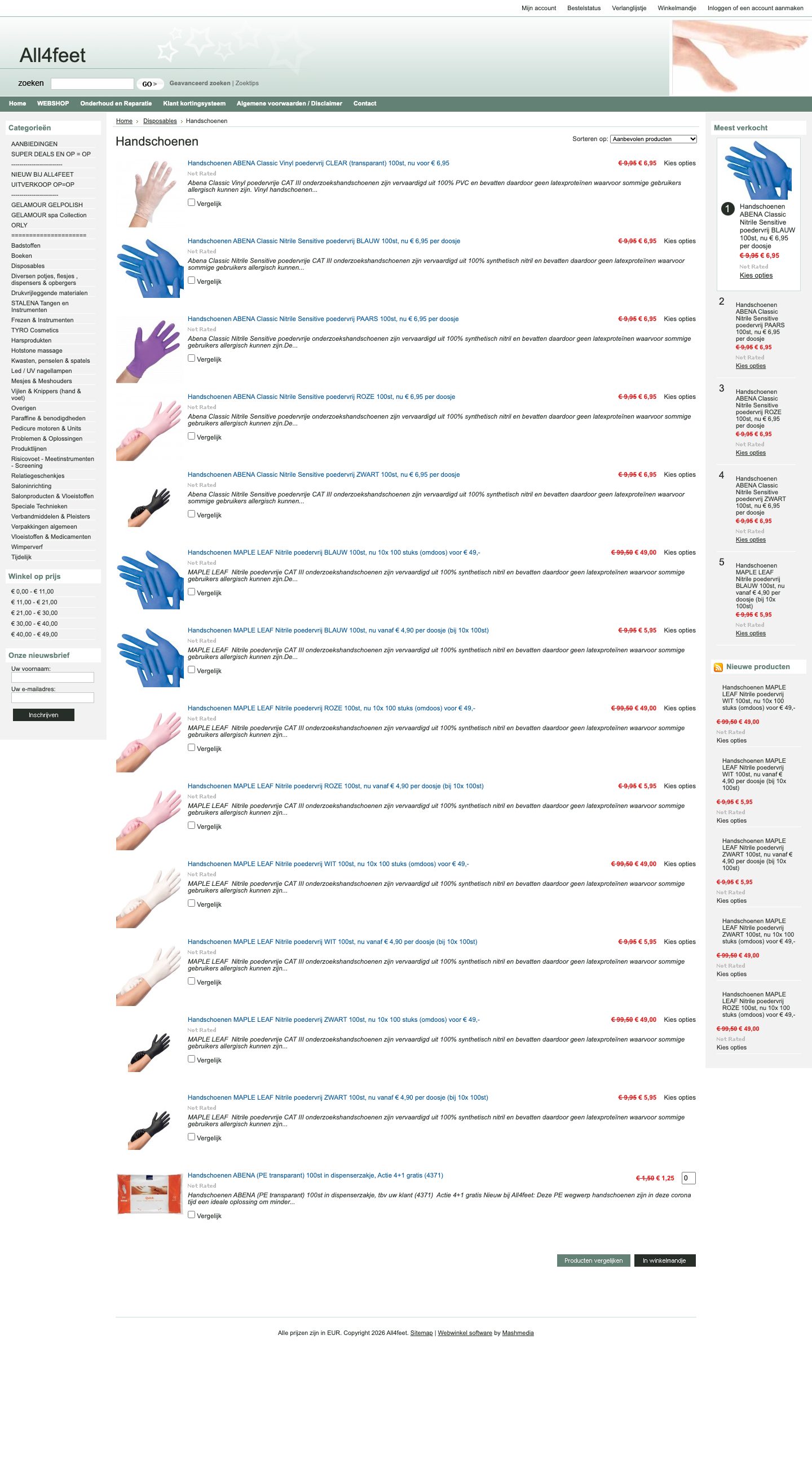
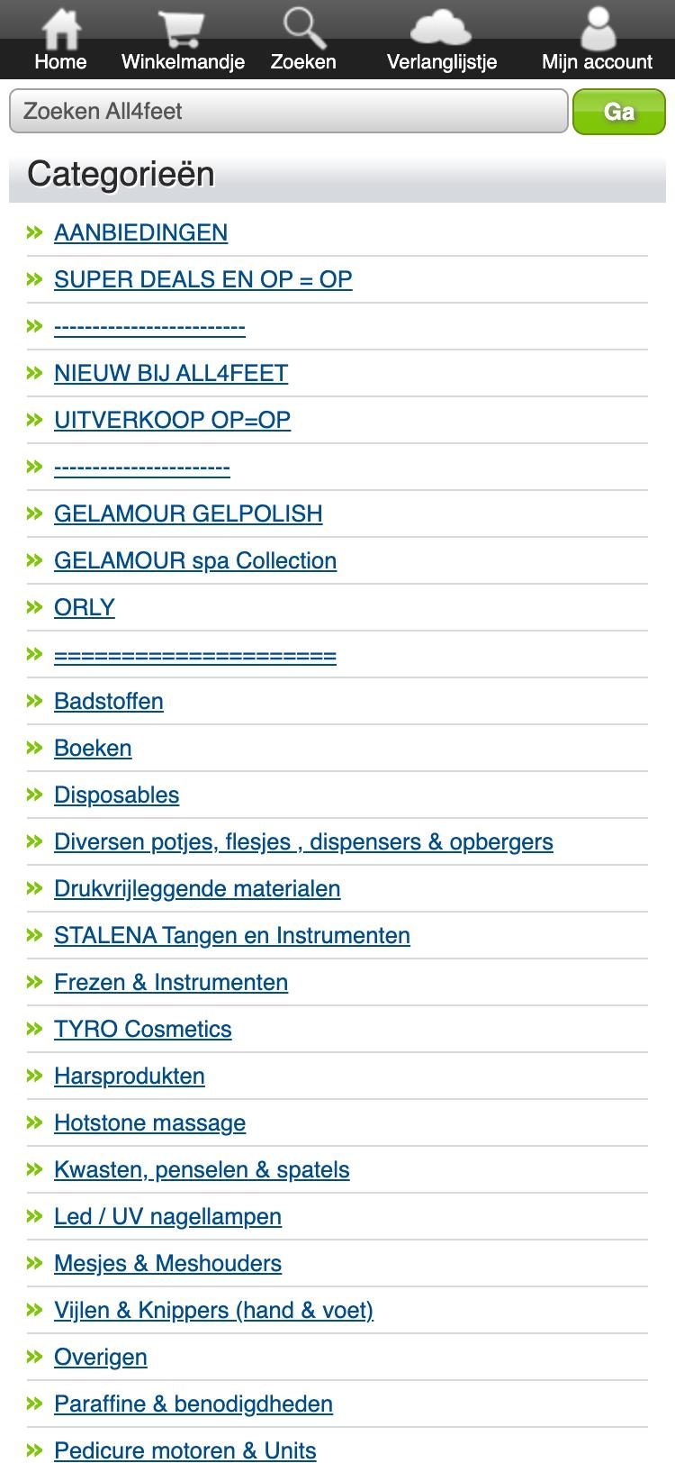
The pitch
One conversation changed the brief
I pitched version 2 to the owner on 18 October. He liked the direction, and corrected almost every assumption behind it:
- Product sales are the core, not the repair service I had put first
- There is no stock system and no online payment: an order is a request on account, and staff call when something is short
- Prices only for logged-in customers; some must never be seen by consumers
- The customer file and SnelStart (bookkeeping) matter most
- Two category levels at most, no expensive plug-ins
- Calmer and more elegant: pedicure and high-end spa, not deals and prices
So I rewrote the brief and started version 3 from those answers.
Process
Information architecture
From 39 lines to four buttons
One organising principle: type of product. Brands get their own page and a filter, offers become a label on the product, the divider lines disappear and the catch-alls get a real place during migration.
The order flow
An order request, not a checkout
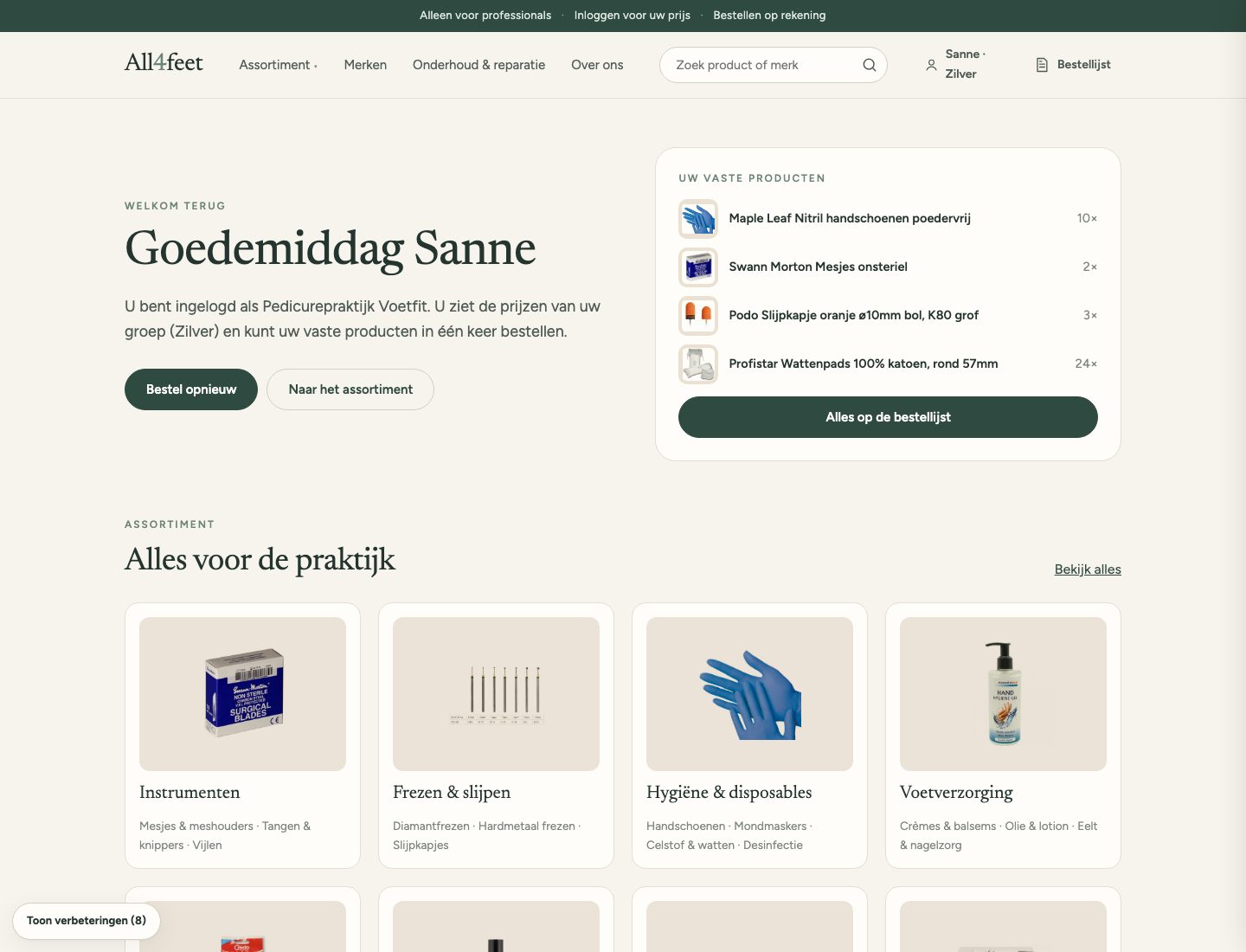
The owner's answers turned the cart into an order list. The customer sends it without paying; the team checks what is in stock, calls if something is short, and invoices from the bookkeeping system. The site says so at every step.
Versions
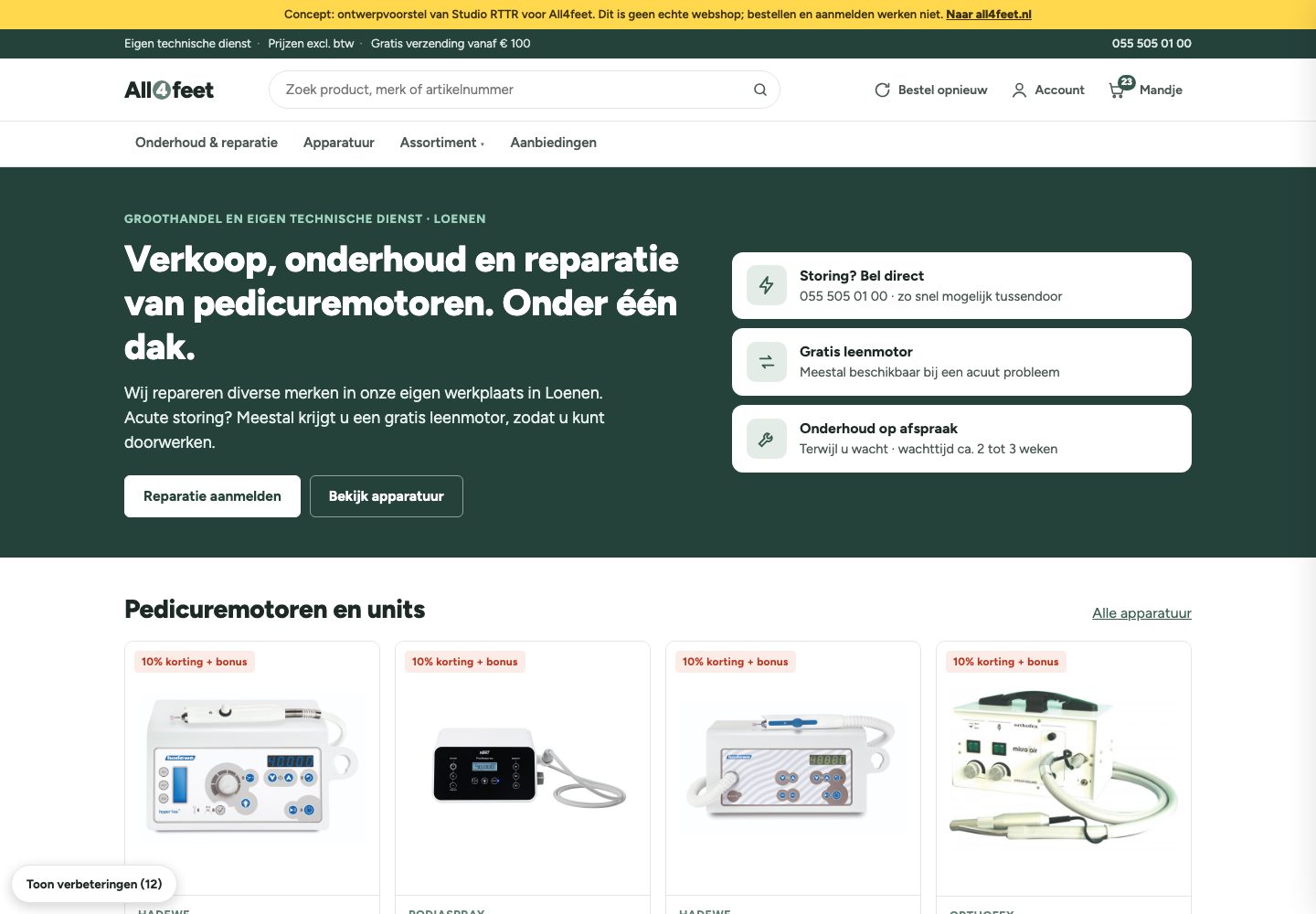
Seven versions in nine days
Every version was saved with screenshots, so each change can be compared with the one before. The biggest turn came from the pitch, not from a test.
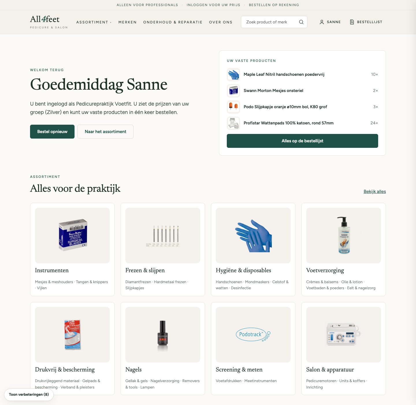
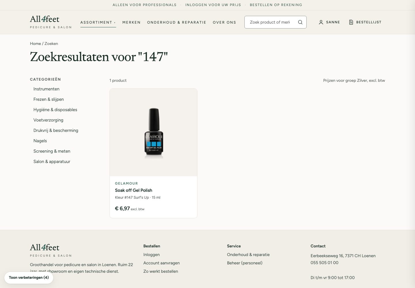
Style
From busy, to calm, to fresh
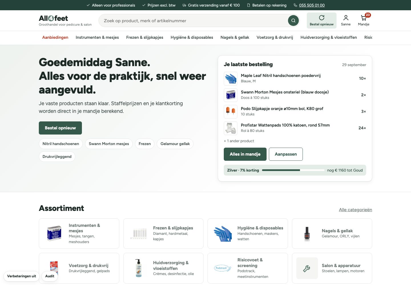
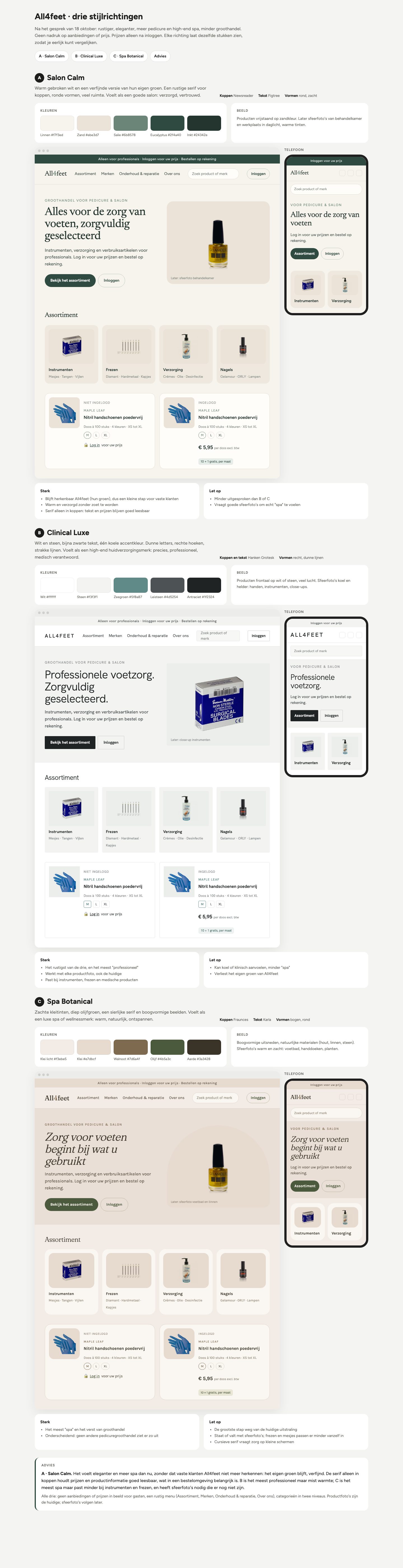
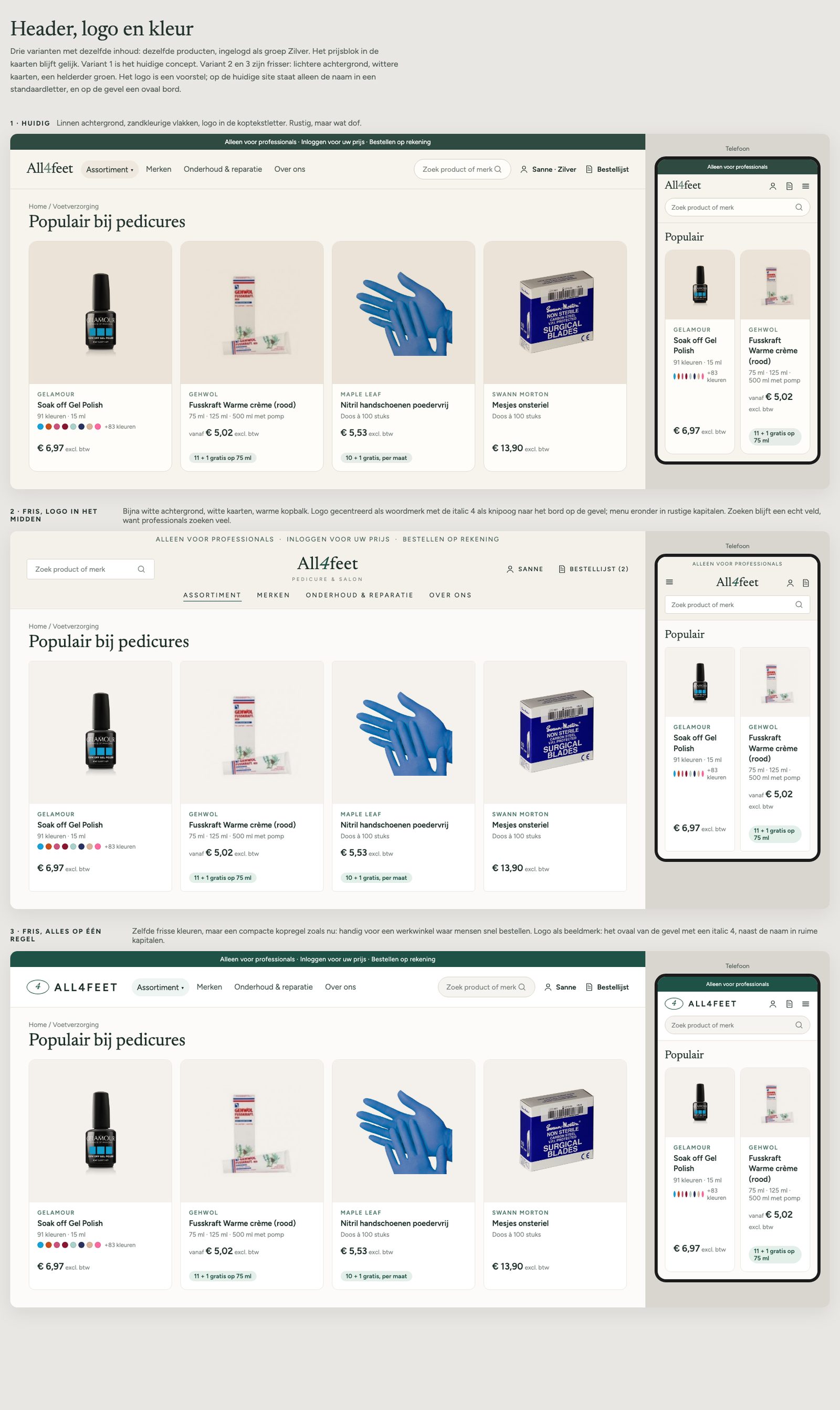
The owner found version 2 too busy. Three style directions on one board led to style A, Salon Calm. On screen it read as muted, so a header, logo and colour board led to a fresher version: a near-white page, white cards and a clearer green. Six new logos didn't beat the simple wordmark, so it stayed.
Two whole brands
Proving the catalogue model
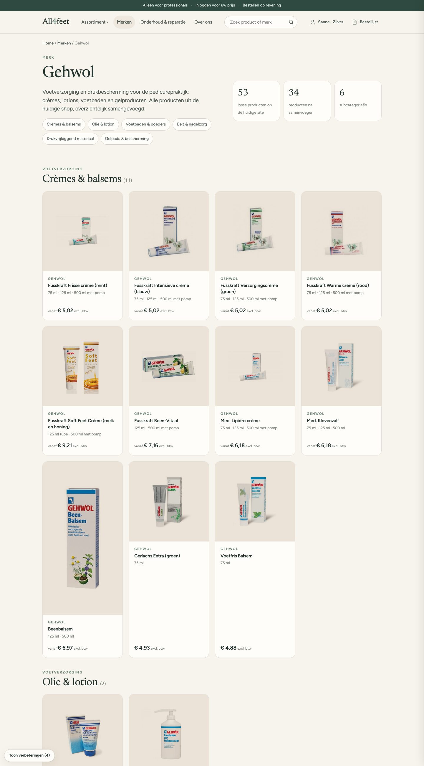
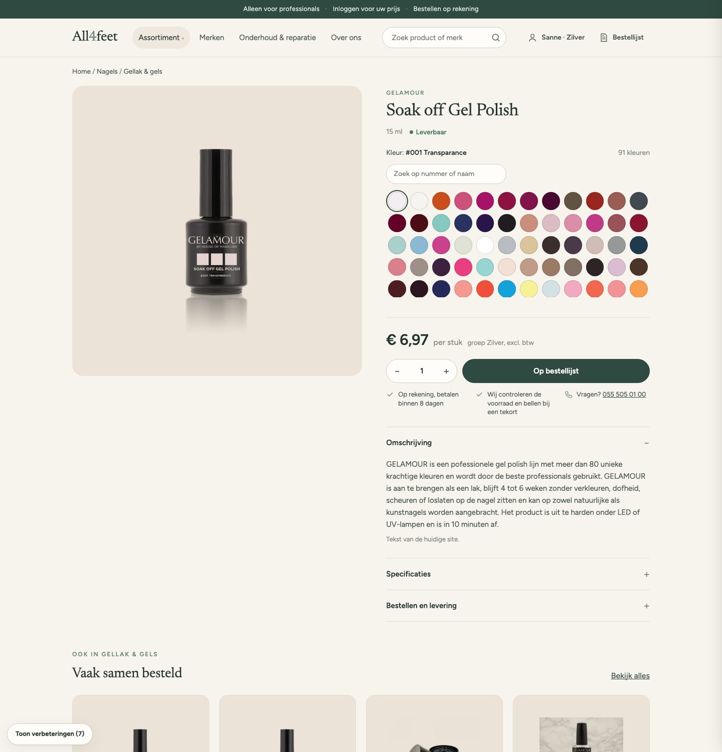
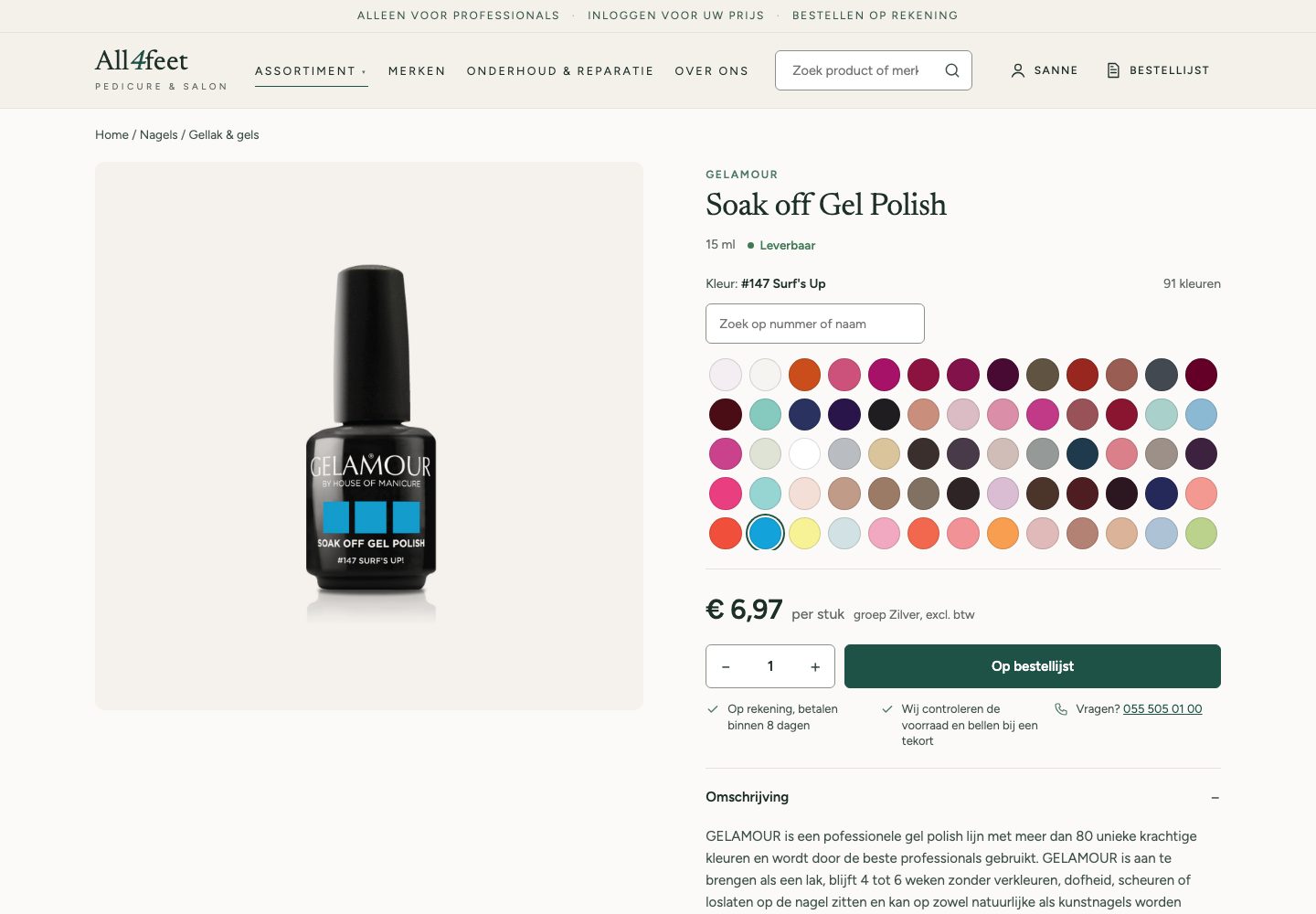
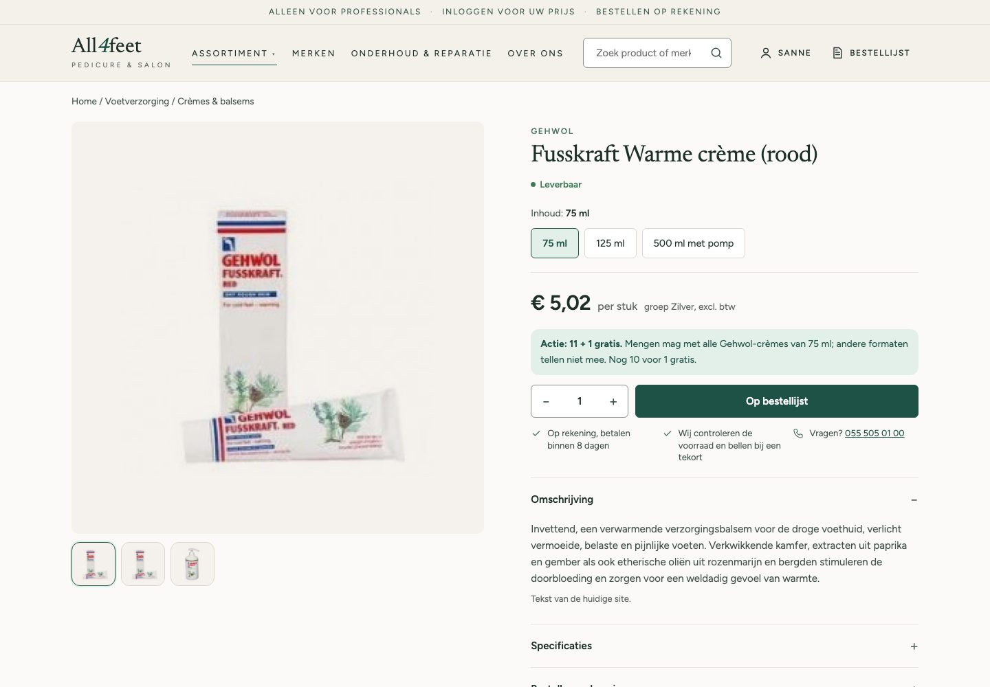
Instead of a few sample products I rebuilt two complete brands from the live shop. Gehwol: 53 listings, one per size, became 34 products with the size as a choice and its own price and photo. Gelamour: 107 listings became 11, with 91 gel polish colours as one product, a swatch for each colour and a search by number.
Design decisions
What changed, and why
An order list instead of a cart
No payment step. “Place order under reservation”, then what happens next in plain words.
WhyThere is no stock system and no online payment. A checkout would have promised something the business can't keep.
Prices only after login
Guests see the range and how to get an account; customers see the price of their group.
WhySome prices must never reach consumers, and the price group is the link with the customer file.
Deals that do the maths
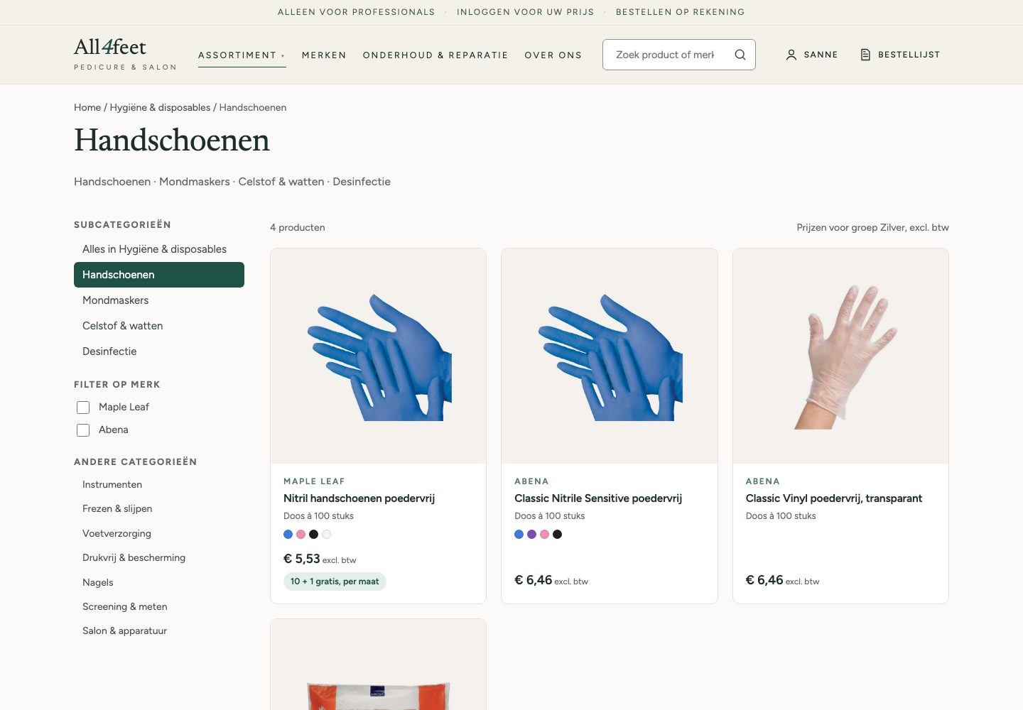
10 + 1 per size for gloves, 11 + 1 mixable across the 75 ml creams, counted in the product page and the order list.
WhyThe rules came from the live site and the owner. Showing how many more you need beats a promo in the title.
Audit my own design
The same method as the first audit, plus contrast, touch targets and a phone pass.
WhyThe concept should meet the standard I held the old shop to, before anyone tests it.
Auditing my own design
What the audit caught
36 of the 51 original findings were solved. But the new design had problems of its own, and I fixed the quick ones before calling it done.
A colour number, “gehwol 75” and the Dutch word “vijl” found nothing; “reparatie” still missed the repair service.
The button worked at € 13,95 while the minimum is € 50.
3.4 to 3.9 : 1. Now 5.3 : 1, and field borders 3.2 : 1.
Search results started under the category list. Found only in real-size phone screenshots.
“Often ordered together” without order data. Renamed to “More in this category”.
Outcome
The result
Calm, fast to reorder, honest about stock
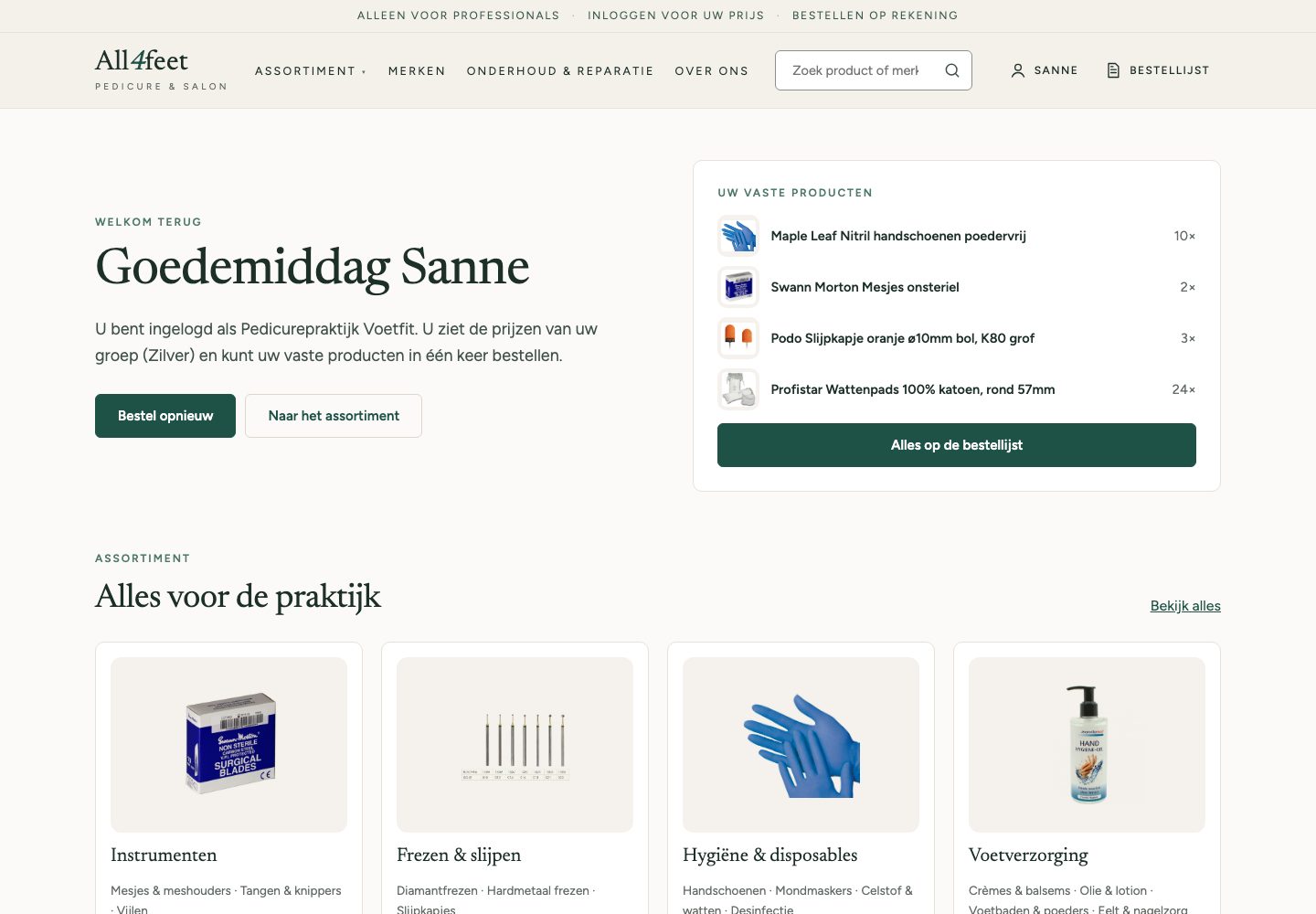
A near-white shop with one green for everything you can do. Logged-in customers start with their regular products; every price is their own; every deal is counted for them.
On the phone
Eleven tasks, before and after
Most orders happen on a phone between two clients, so I compared eleven tasks at the same screen size, the old shop next to the concept.

Design system
Built from the code
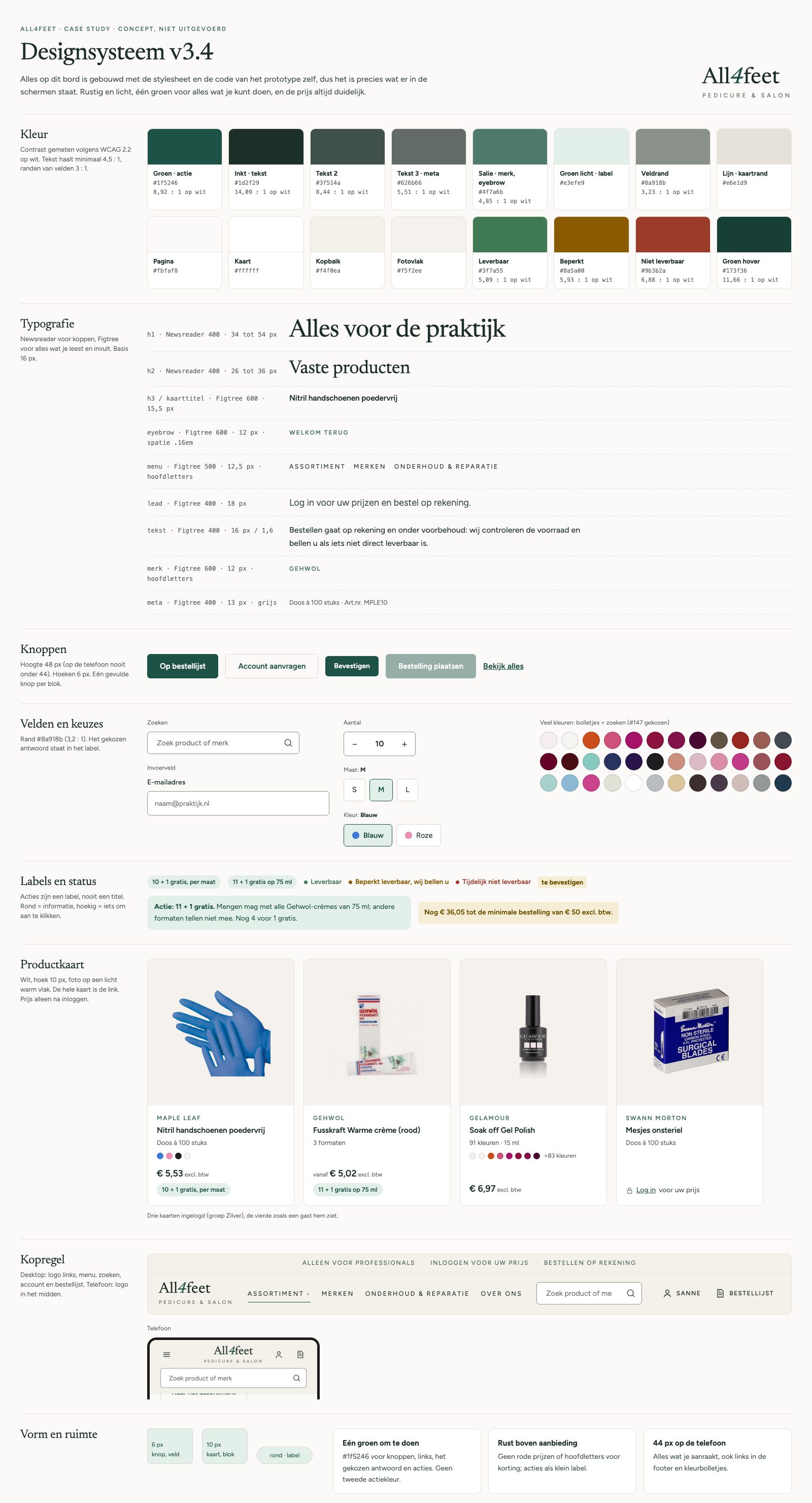
The board uses the prototype's own stylesheet, so it can't drift from the screens: colours with measured contrast, type, buttons, fields, labels and the product card.
In numbers
Before and after
Where it stands
Delivered, and honestly open
- An audit of the live shop and a platform advice (WooCommerce, lean)
- A clickable prototype with prices per group, deals, an order list without payment and a staff page
- Two complete brands as data, ready to show the migration
- An audit of my own design, with the quick fixes done
Not done yet: no tests with users (a card sort and a remote task test with pedicurists are planned), the SnelStart link is unconfirmed, product photos and texts still come from the old shop.
AI in my process
Research, code and data, decisions mine
AI crawled the shop, measured contrast and targets, wrote the prototype code and turned 160 product pages into data. I set the brief, chose every direction and rule, and checked the claims. One check caught a wrong number: the menu has 39 lines, not the 35 the first audit said.
- Step 1
Audit
Pages crawled and measured; severity and fixes judged by me.
- Step 2
Prototype
HTML, CSS and JS written by AI; scope, style and every revision mine.
- Step 3
Brand data
160 pages fetched and grouped; swatch colours read from photos, about 25 by eye.
- Step 4
Self-audit
Measured by AI, the fixes chosen and approved by me.
Product texts copied from the live shop are labelled as such in the prototype; anything not confirmed by the owner is marked “te bevestigen”.
Reflection
What I'd do differently
- Talk to the owner before repositioning
I rebuilt the homepage around second-hand information that repair was the core. One conversation reversed it. The brief should have come from him first.
- Test the order flow first
I designed a checkout with payment for a business that doesn't take payment online. Asking how an order actually travels through the shop would have found that on day one.
- Check numbers at the source
“35 menu items” travelled through every document until I recounted for a diagram: it was 39. Counting from the page source, not from a screenshot, would have caught it.
Next case
Client Portal