Case 04 / 07 · Brand system · Packaging · E-commerce
Home Remedies
Unscented skincare, laundry and tea, made in small batches in Cape Town. A brand that looks precise rather than homemade, built on one promise: every ingredient, every percent.
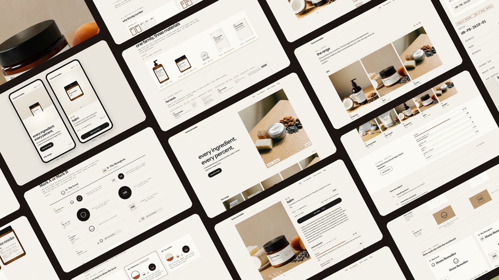
A kitchen-made range had to look precise, not homemade, and stay within strict rules: no fragrance, no medical claims.
Audited my own brand files, tested two marks in six real contexts, four typefaces on one label, a shelf test, nine photo versions and a shop.
A brand system, labels for five products and a site with an “every percent” component. Real photos and prices are still open.
Context
The brief
Precise, not homemade
Turn a kitchen-made, fragrance-free skincare and home range into a brand that looks precise rather than homemade, without hiding that it's made at home, and that could one day sit on a supermarket shelf. One person, working in 20 to 45 minute windows around a baby.
Every ingredient. Every percent.
The audit
Thirteen problems, before any design
The first step was an audit of my own brand files, not a moodboard. It found contradictions, gaps and risks that would have leaked straight into labels and copy.
“Pregnancy-safe” is a claim the research said never to make. Fix: “formulated for pregnancy and postpartum”.
“Digestive & calming” is the wording food law prohibits. Fix: name it for when you drink it.
“Face cream” in one file, “postpartum balm” in another. No label until one name is chosen.
Full percentages are the strongest differentiator, but the layout only had an ingredient line.
Batch code, address, PAO symbol and warnings had no slot.
Elegant online, a problem on a shelf. To test in the packaging phase.
Process
Open the full process canvas → Every board and version on one Figma-style page.
Logo mark
Two marks, six real contexts
A mark lives on caps, lids, avatars, favicons, embossing and boxes, so I tested both options in all six instead of on a white page.
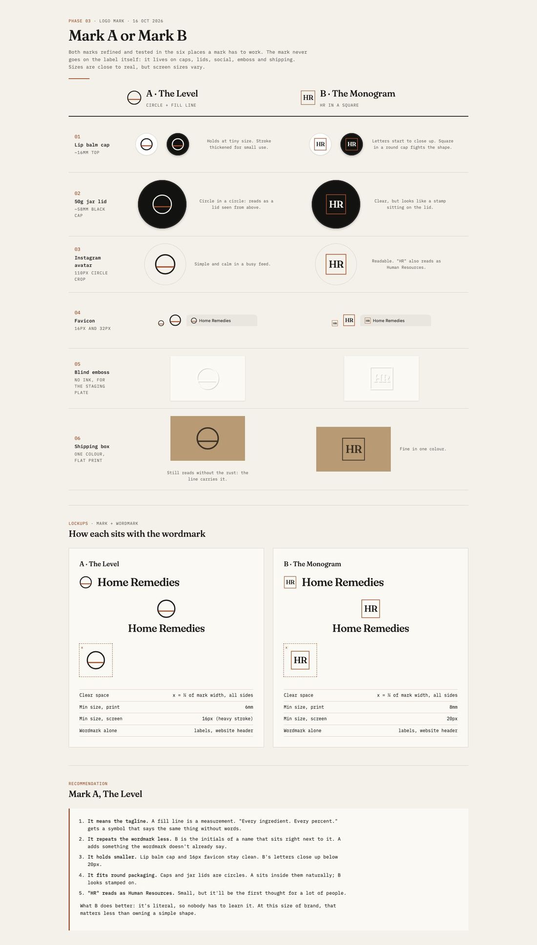
The reversal
Context changed the answer
The first pick was the abstract circle. After seeing it on an actual lid, and adding a rule that the mark never sits next to the name, the main objection to initials disappeared. The final mark became a lowercase “hr” in a circle.
A test sheet alone didn't get me there. Seeing it in place did.
Packaging
One family, three materials
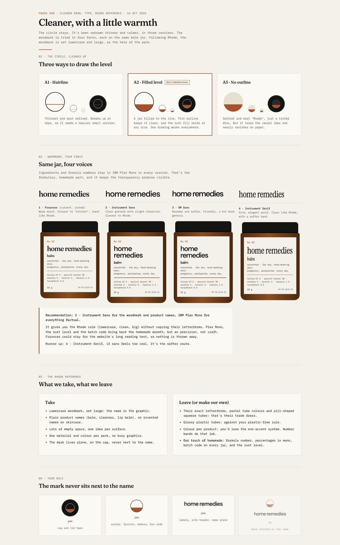
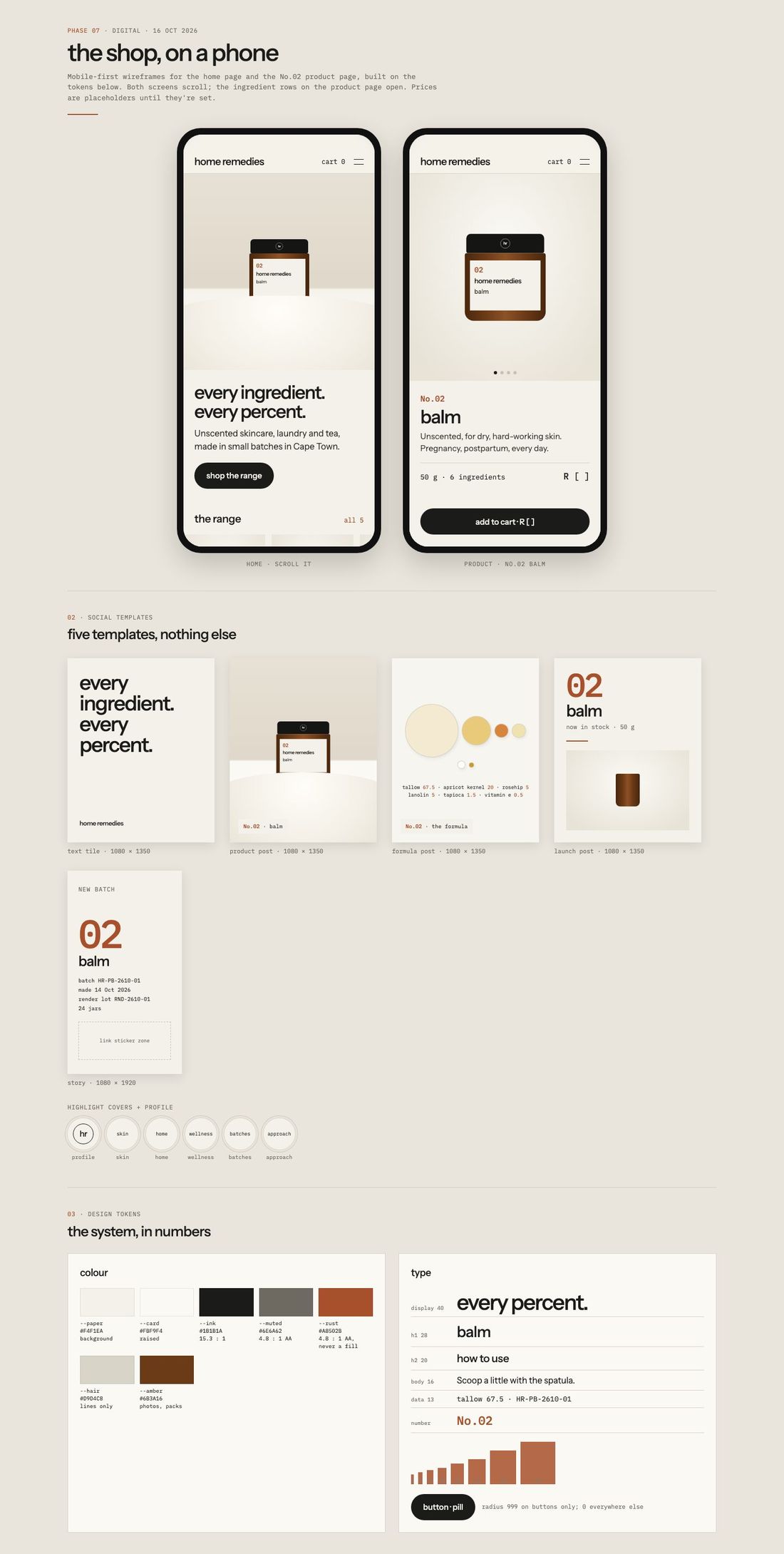
Amber glass for oils, aluminium for the lip balm, paper for dry goods. Black lids carry the mark, bodies carry the name, and a large rust formula number is the shelf anchor.
Photography
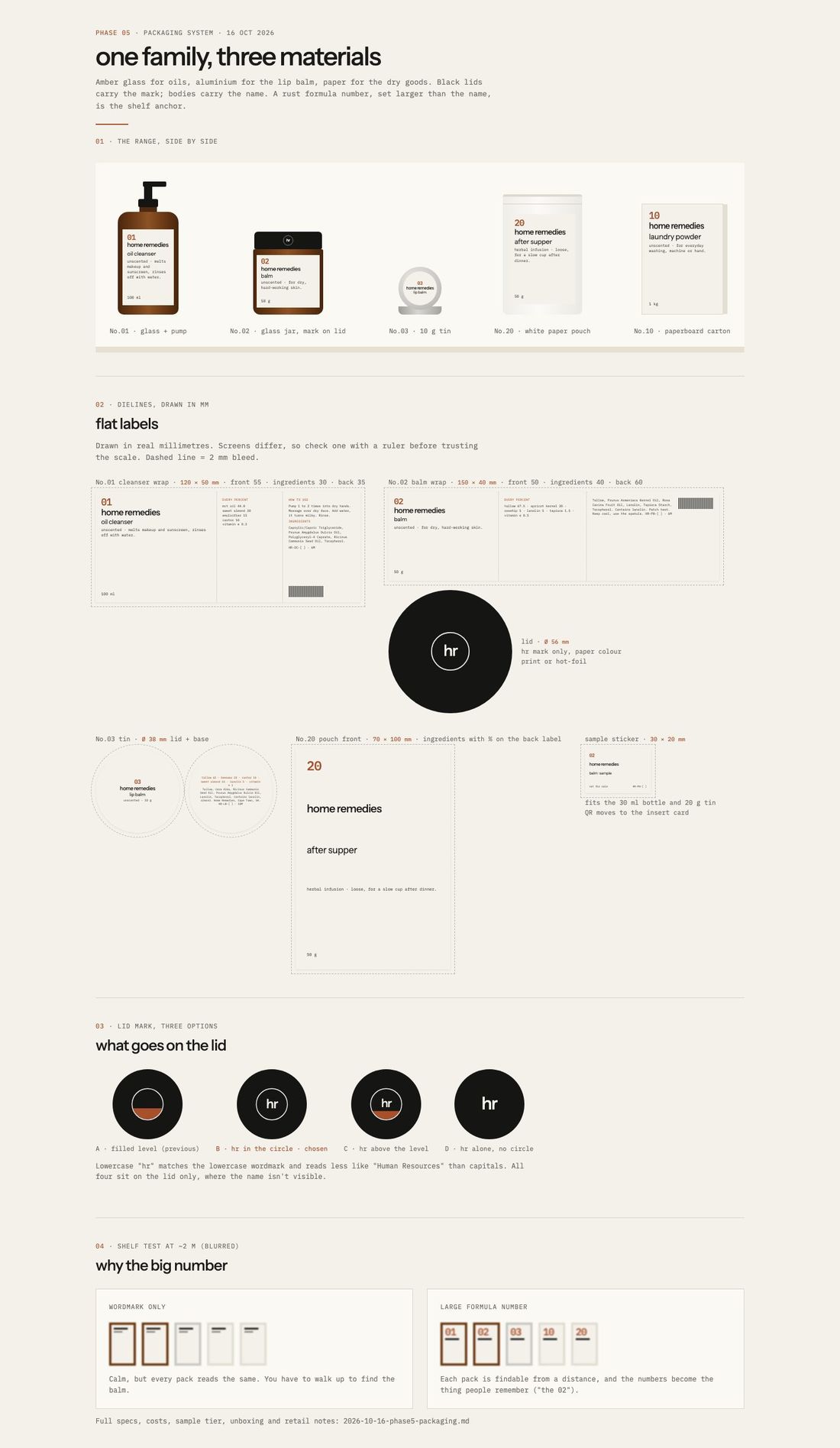
Nine versions of one hero shot
The hero photo went through nine versions before the oak table won: from tapioca, via ingredients, garden and kitchen, to a calm close-up where the label stays readable.
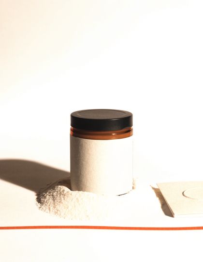
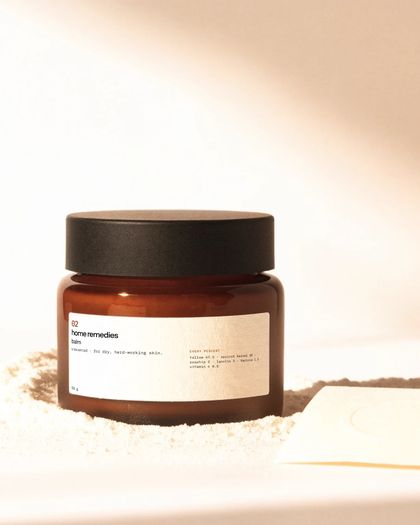
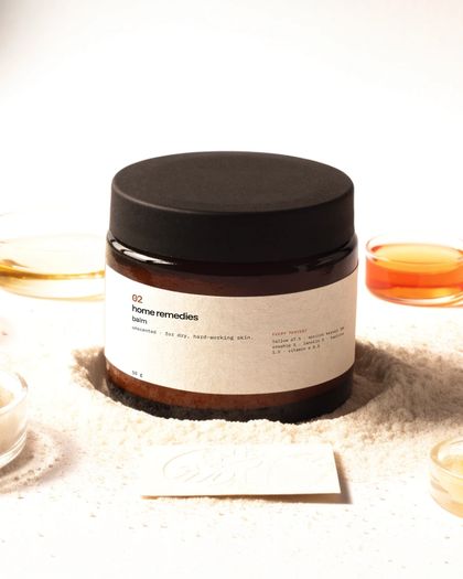
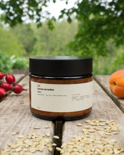
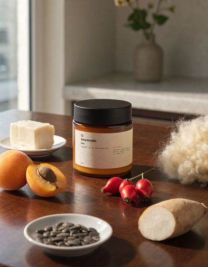
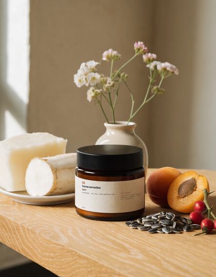
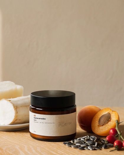
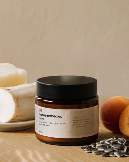
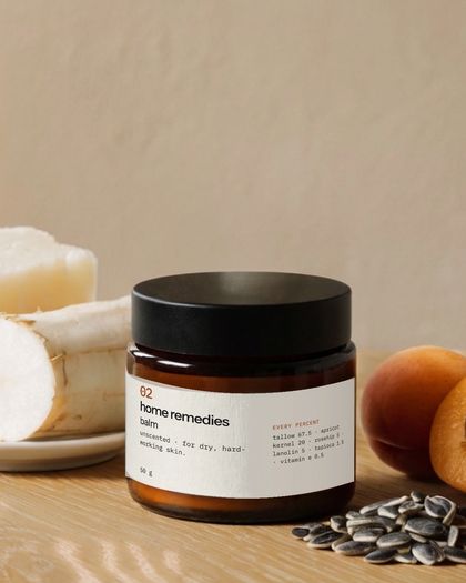
These are AI-generated concept images with the real label composited on, made to judge the art direction. They will be replaced by real photos before launch.
Design decisions
What changed, and why
“Every ingredient. Every percent.”
Chosen over the recommended “Unscented, on purpose.”
WhyTransparency is the one thing competitors can't copy. I overruled the recommendation on purpose.
Formula numbers as architecture
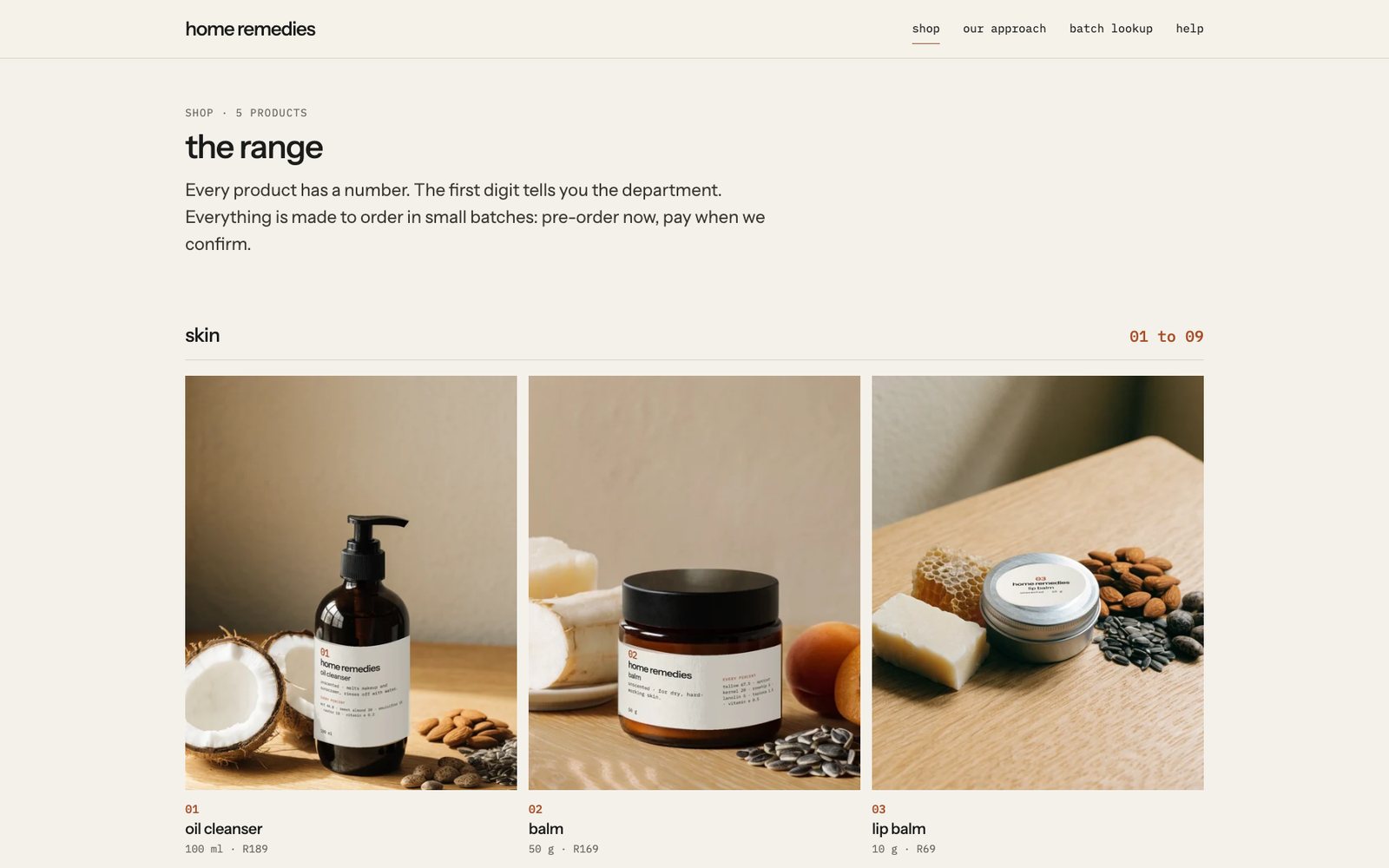
01 to 09 skin, 10 to 19 home, 20 to 29 food. One brand, no sub-brands.
WhyOne founder can't run five brands. The number is both the system and the shelf anchor.
One label template
The cleanser label became the template for all five products.
WhyReview caught that two labels broke the system. Consistency came from checking, not from the first draft.
“Every percent” as a component
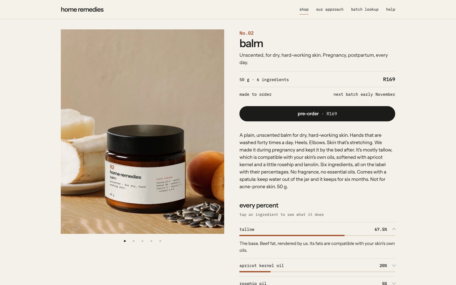
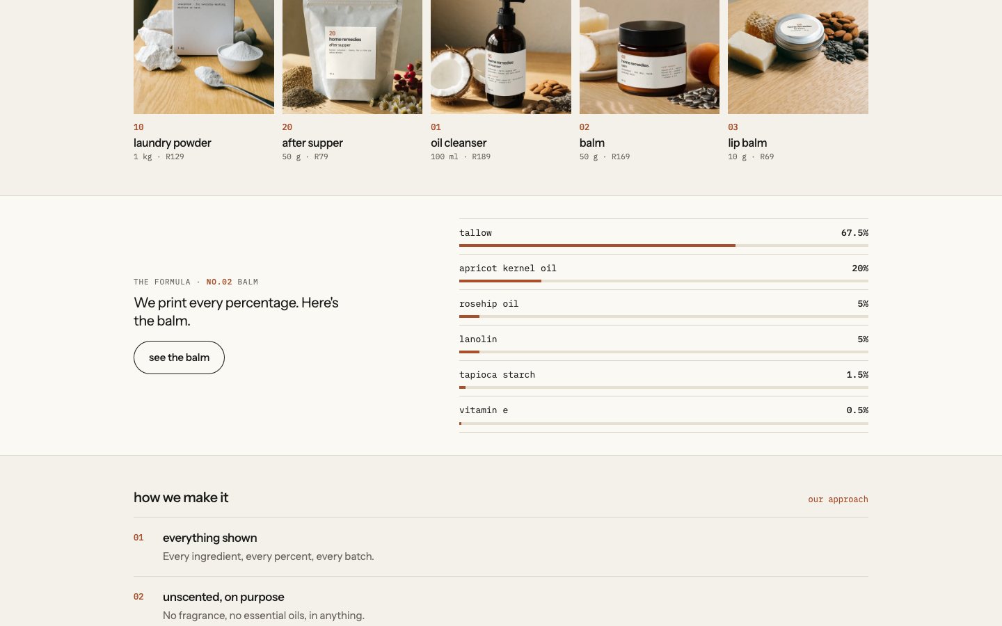
Ingredient rows with a bar sized by percentage on every product page.
WhyThe label's promise, made interactive online. One idea, two media.
Outcome
The shop
Every percent, online
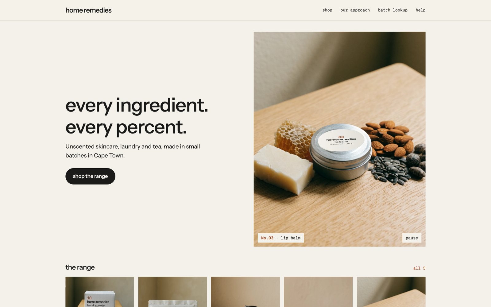
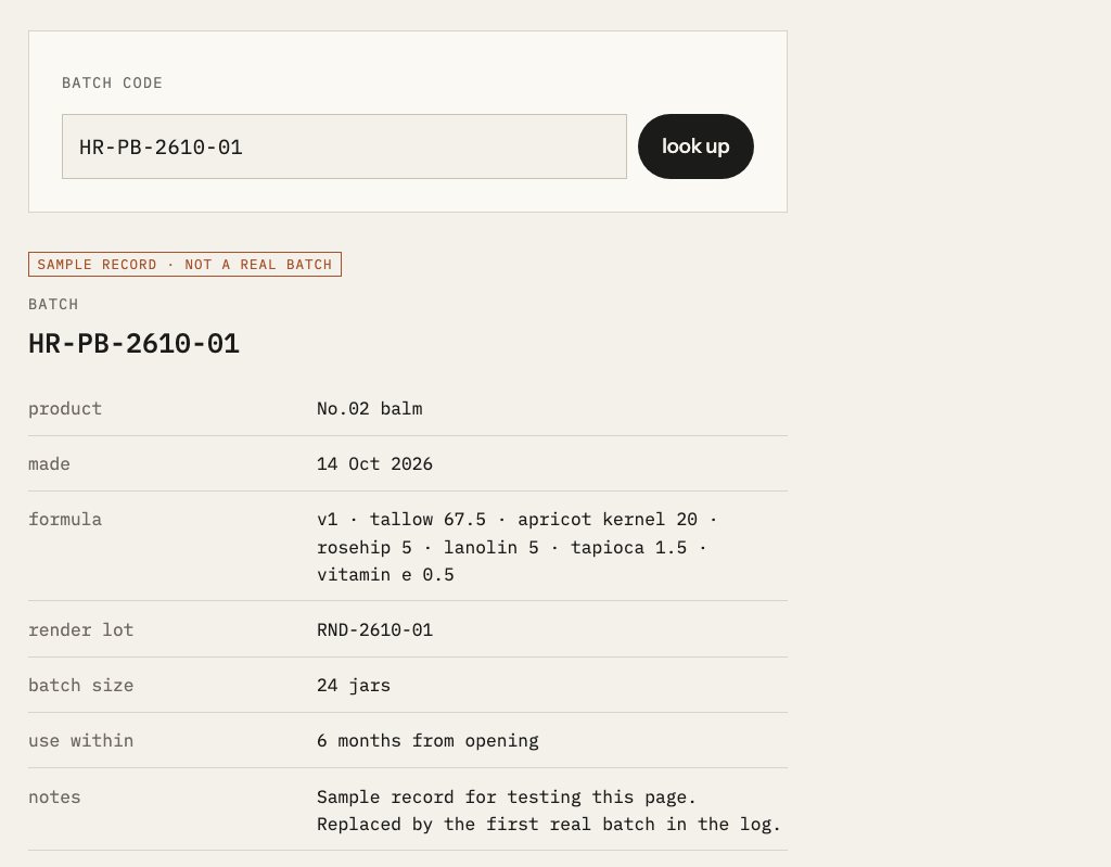
A static site for pre-orders and a waitlist, generated from one file with the product data, so five product pages always stay in sync. The homepage hero moves through the range, with a pause button for anyone who wants it still.
Where it stands
Delivered, and honestly open
- A one-page brand guideline and a mark tested in six contexts
- Label copy for all five products, checked against the claims rules
- A packaging system: three materials, one label layout, dielines in millimetres
- A site with the every percent component and a batch lookup no local competitor has
Not done yet: no real photos, no printed labels, prices not set, stability testing still running, regulatory sign-off pending.
AI in my process
Drafts and stand-ins, decisions mine
AI helped audit the files, draft label copy against the claims rules, build the site and generate concept photos. Every claim was checked against the rules; every visual decision was mine.
- Step 1
Audit
My own brand files checked for contradictions, gaps and risks.
- Step 2
Copy
Label copy drafted, then checked against what the law and my research allow.
- Step 3
Concept photos
AI images with the real label composited on, to judge the direction.
- Step 4
Build
A site generated from one data file, with the percentages as data.
The concept photos are labelled as AI-generated in the project files and will be replaced before launch.
Reflection
What I'd do differently
- Test in context from the start
The mark reversed in a single day once I saw it on a lid. If I'd started with real contexts instead of a test sheet, I'd have saved a round.
- Write the claims rules before the brand
Two of the thirteen audit findings were claims I had written myself. Starting with a list of words I may not use would have kept them out from the beginning.
- Shoot real photos earlier
Nine concept versions helped me find the direction, but they can't prove how the real jars look. A phone test shoot of one real jar should have come before version five.
Next case
Dental practice